RacesReviewed / News
2025 Boston Marathon by the Numbers: Why the Fields and Splits Still Jump Off the Page
A numbers-driven post inspired by statistical Boston coverage, with a few visual notes on why race data is often one of the quickest ways to hook runners into deeper exploration.
Big race numbers do more than decorate a page. They help runners understand scale, pace, and just how unusual a major-marathon weekend really is.
Good race numbers make scale feel real
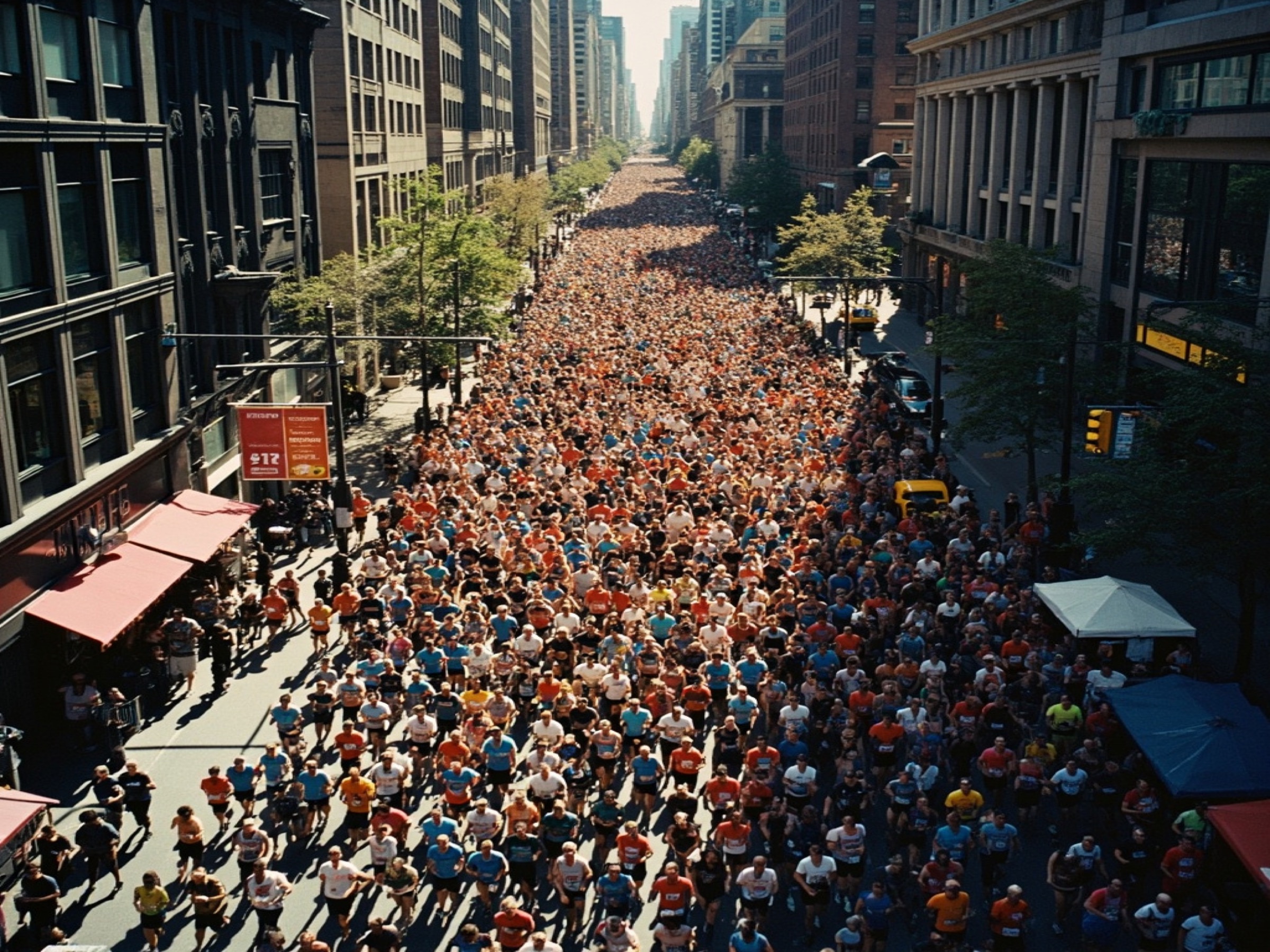
The best number-heavy race posts work because runners love scale. How many qualified. How many started. How many countries showed up. What the weather did. Where the big surges happened. A marathon as famous as Boston can feel oddly abstract until you see the data arranged in a way that lets the size of the event actually register. Numbers can make a major feel less like an icon and more like a real, enormous thing that happened on real streets to real bodies.
That is especially true with a race like Boston, where the mythology can blur the logistics. Statistics cut through that haze. They tell you how deep the field really was, how unusual the splits looked, how conditions may have shaped the day, and how many people were involved in the spectacle you watched or imagined. Good numbers do not make a race colder. They often make it more legible.
This is also why data-heavy race coverage tends to travel well. A single stat can hook someone who would never commit to a long article upfront. It gives readers an angle. It creates scale in seconds. It says: here is one thing worth reacting to, and from there the story can widen.
The strongest numbers point toward better questions
What makes numerical coverage useful is not merely the presence of numbers. It is the way they lead a runner deeper into a race. A stat about field size can lead to questions about qualifying standards and accessibility. A stat about split patterns can lead to pacing strategy. A stat about weather can lead to a much richer discussion of who handled the day well and why. The best numerical coverage is not decorative. It is directional.
That matters for product design too. If a page only throws isolated numbers at the reader, it risks becoming trivia. But if the numbers are arranged as prompts into deeper research, they become one of the most efficient on-ramps in the entire experience. A runner who clicks because a stat surprises them may stay because the surprise sends them toward course shape, field context, or historical weather. In other words, numbers are not the endpoint. They are often the invitation.
Boston is especially suited to this style because the race has scale, history, status, and familiar course landmarks. Data can animate all of those at once. It can show how rare something was, how deep a field looked, or how conditions reframed expectations. Numbers help readers move from admiration to interpretation.
Why number-driven coverage works
Fast hook
SecondsA stat card gives runners something to react to before they commit to a long read.Share value
HighNumbers and visual summaries travel well in group chats and social posts.Research payoff
RealOnce runners care about the numbers, they are more likely to open deeper race analysis.What a future infographic set could emphasize
Field scale
HugeMajors hook casual readers with raw event size.Pacing intrigue
EndlessSplit patterns give runners an immediate entry point into strategy.Weather overlay
CriticalBoston especially becomes more interesting when the data meets the course.The challenge is making the numbers feel alive
The temptation with a famous race is to assume any stat will feel important because the event itself is important. That is not quite true. Numbers only land when they are framed well enough for a human reader to understand why they matter. Saying a field was huge is weaker than showing how unusual that scale is. Saying a split was dramatic is weaker than helping a runner see what it means for the shape of the race.
This is where visual treatment earns its keep. A chart, a stat card, or a compact comparison block can do work that prose struggles to do quickly. Readers notice contrast faster than they absorb explanation. The right visual can make a marathon weekend feel immediate in a way that paragraphs alone sometimes cannot.
That is why number-driven coverage belongs on a site like this. Runners do not only want stories and service information. They also want fast, intelligent entry points into the scale and texture of an event. When the numbers are chosen well, they can be one of the sharpest tools we have for making a race feel real.
Why this style of coverage fits Boston especially well
Boston is unusual because it offers both emotional mythology and hard data in abundance. The race has recognizable landmarks, deep qualifying culture, historical weather intrigue, and a public that already expects meaning. That makes it fertile ground for number-led storytelling. You can move from field size to qualification pressure, from split patterns to course strategy, from weather to runner experience, and the page keeps opening outward.
In other words, the statistics do not compete with the romance of the race. They deepen it. They show why the day felt hard, how unusual a performance was, or just how large the whole machine really is. That is what makes Boston-by-the-numbers coverage more than a visual gimmick. Done well, it is a way of translating the magnitude of the marathon into something a reader can feel quickly.
More coverage
Keep reading
Editorial
2026 Boston Weekend Preview: Stars, Storylines, and What Runners Should WatchThe pro fields matter, but so do the rhythms of Boston weekend: the 5K, the invitational mile, and the feeling that the whole city is warming up for Monday.
Open articleEditorial
Boston at 52: Amy Johnson's Long Road to HopkintonAmy Johnson from Worcester, MA qualified for Boston at 52. Her finish time of 4:15:00 was just the beginning of what turned out to be a much bigger weekend.
Open articleEditorial
Athens 2030 Will Host the World Marathon Championships, and That Feels RightSome championship announcements are administrative. This one lands differently because the city itself carries so much marathon symbolism.
Open article